You want to apply your brand colors (or any other color palette) to your Canva designs quickly, but you find that the Brand Kit gives you unconsistent and non-satisfying results? Or you don’t have access to the Brand Kit feature, because you’re on the free plan?
Then you’ll love this quick and easy tip to apply any brand color palette to your templates – in just two clicks.
This way is also perfect if you want to try different combinations of colors before choosing your brand color palette.
Canva Quick Tip: How to Apply any (Brand) Colors to your Templates in Canva
The first step is to find an image of a color palette or create it yourself. We’ll be using a handy Canva feature that lets you apply the colors of an image to your designs.
1. Choose a color palette image
You need a graphic that includes all the colors you want to use (similar to a brand board, but showing only colors).
To create an on-brand vibe, start with a branded photo or search Pinterest for “[brand adjective] color palettes”.
If you have your brand colors defined already, use our Free Brand Palette Templates to create a custom graphic with your colors ????
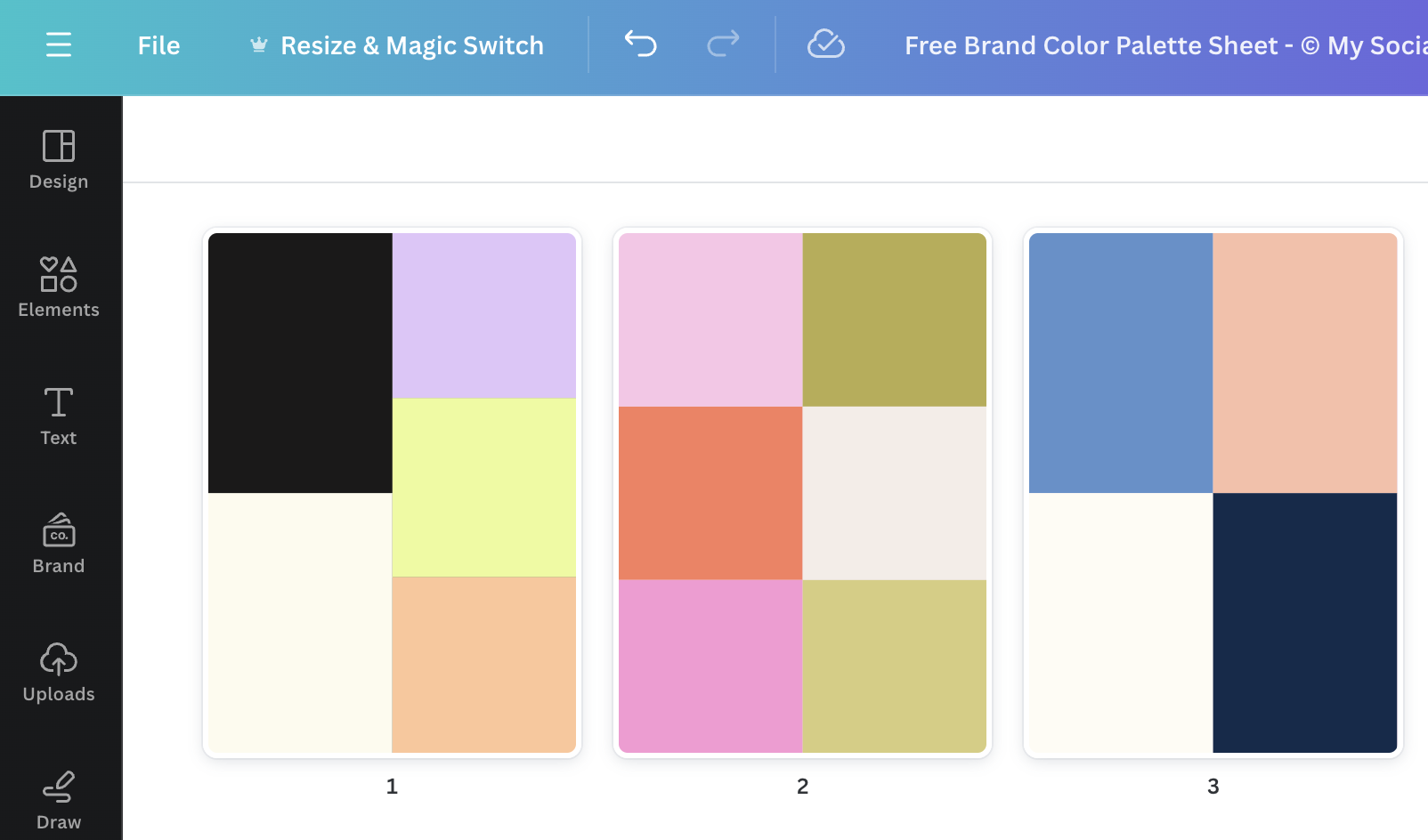
2. Upload and add the image into your design
Now you upload your color palette image to Canva and add it onto the page where you want to change the colors. Don’t worry, you’ll delete the image later when we’re done.
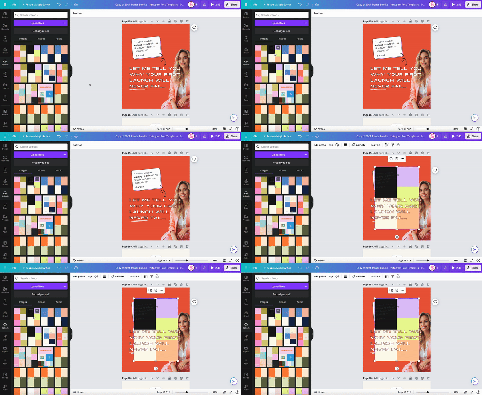
3. Apply image colors to the design
Right-click on the image and choose “Apply colors to page”.
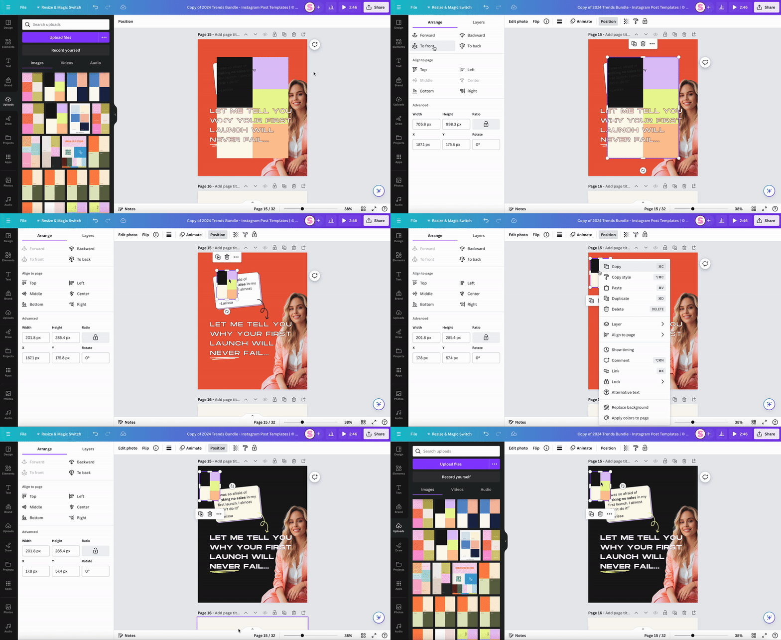
4. Optional: Find your perfect color combination
You can apply this feature multiple times to see which color combination you like the most or to give different templates a different combination (perfect for your Instagram feed templates).
Afterwards, you can also change single colors to make it look more like your brand.
Designer tip: To make sure all colors have enough contrast and are legible, use Canva’s Accessibility Check ????
5. Check your colors for contrast and legibility
Canva has a new feature that comes in handy to check your color palette’s contrast and make sure all fonts are legible on their background colors.
You’ll find this feature by clicking on “File” in the upper left corner of the screen and going to “View Settings” and “Check Design Accessibility”.
A panel will appear on the right, where it’ll show you problems with your typography and colors.
When you click on colors, it’ll list all the spots where your color contrast is too low – and even give you suggestions for better color combinations you can apply in one click.
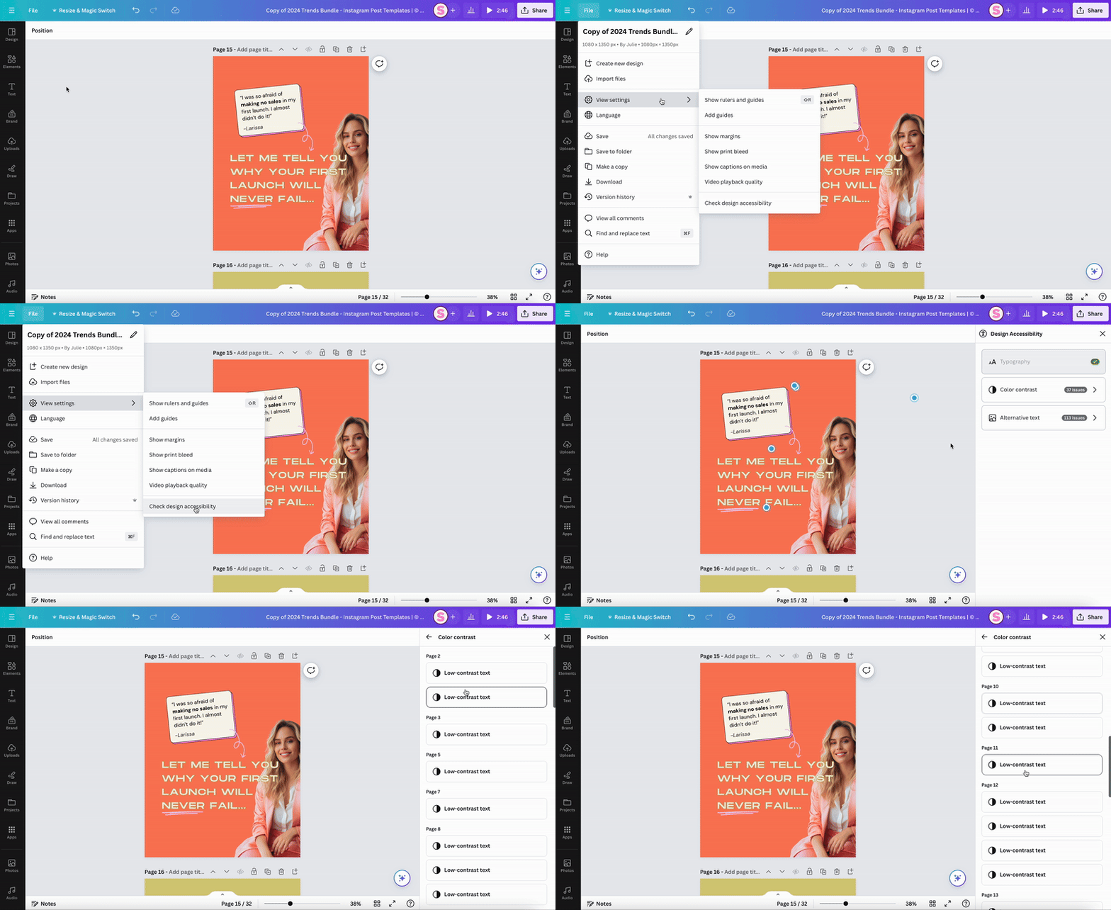
And that’s it. Did you find this mini tutorial helpful? Let me know in the comments below!






3 Responses
That’s a great giude. Color is very difficult for me and I always try to watch a video or read articles about colors.
This is exactly what I’m looking for, but wasn’t able to get the image copied onto the page like you do in step 2. I figured out a work-around, but then canva doesn’t show me the option to apply colors to page.
Hi! So great you found this helpful. Simply upload the image into Canva at the “Upload” functionality. Then click on the image and it will appear on the page. 🙂