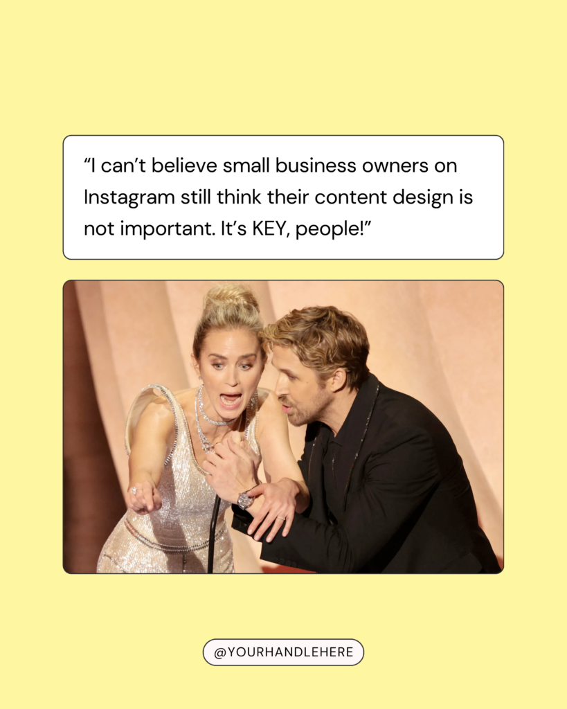
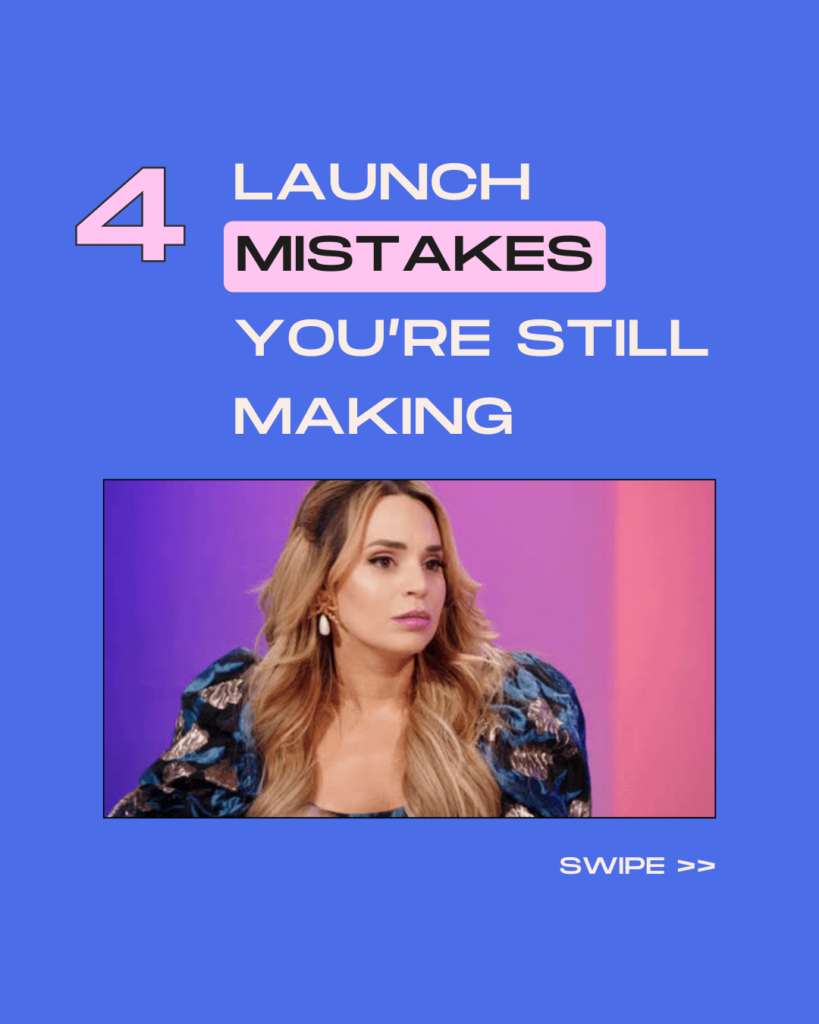
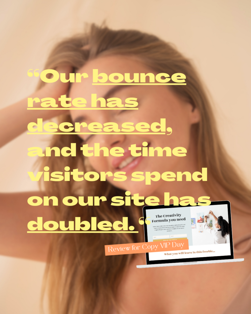
Do you want to know the biggest design mistake I see online businesses make with templates?
They don’t customize them to fit their brand.
I totally get it. Just fill in your content and you’re done. That’s why Canva templates are so freaking amazing. They save you a lot of time and look professional even if you’re not a born design genius.
But if you don’t change up the branding, your graphics will always look a bit too much like a template.
And then you won’t be able to stand out with your content and build a memorable brand.
To make sure this doesn’t happen to you, let me share with you 5 simple designer tricks to make any template look 100% like your brand, 0% like a template – and 100% ready to attract your dream clients!
Designer Tip #1: Use Canva’s Brand Kit
The easiest way to make sure your templates always look like you is to use the Canva Brand Kit. There you can store your brand colors and fonts and always have them at your fingertips.
Plus, you can apply them to your designs with one click, saving you tons of time!
When you’re inside the Canva editor, you’ll find your brand kit in the left menu bar at Brand Hub.
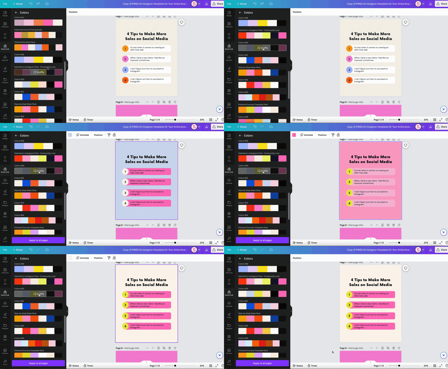
Note: Sometimes the one-click branding function doesn’t quite match your design. In that case, it’s important that you follow the next two tips! ????
Designer Tip #2: Apply your Brand Colors
This is an important PSA for anyone using our templates who doesn’t like pink ????
No, seriously – templates are such an amazing tool because they allow you to use a strategic blueprint and make it yours entirely. And that always starts with changing the colors to fit your branding!
A designer rule I like to stick to is not using more than 5 colors on one graphic.
Also, try to stick to 1 or 2 colors you use for your headlines and 1 for body copy. Fill elements and text with the same color if they were also colored the same in the original template (trust me, the designer thought about it for you).
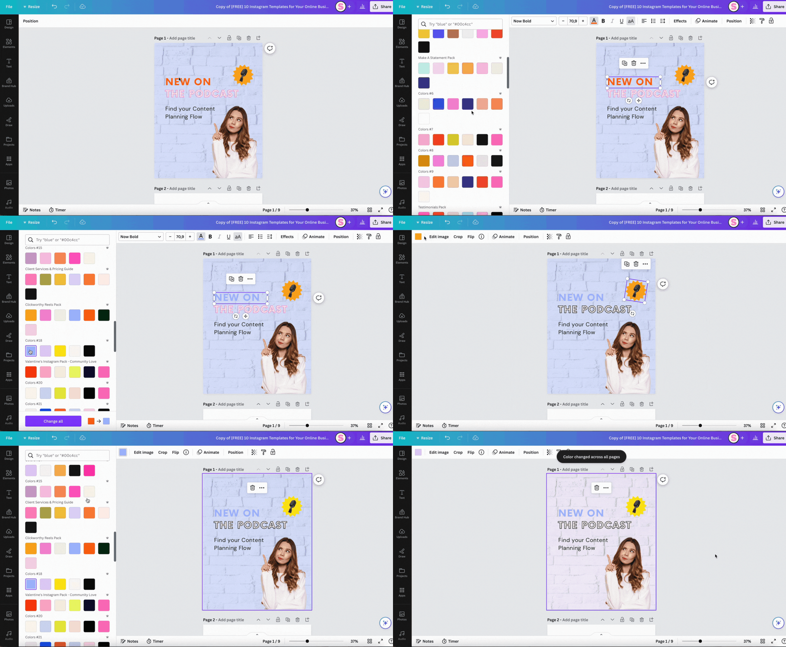
When you choose an element or text box to change its color, scroll down a bit on the color panel to find your saved color palettes from your Brand Kit.
When you change a color, you’ll also have the option to change it across all graphics (see the purple button).
Related Article: How to Apply a Color Palette in Canva
Designer Tip #3: Add Brand Fonts to your Design
Your colors are all set, now let’s move on to fonts!
Choosing brand fonts can make all the difference between a design that still looks template-y (especially if it’s a popular template and many people just use it like it is) – and your unique branded design.
My designer advice? Don’t use more than 3 different fonts on your design – ideal are 2 (one for the headline and one for smaller body copy).
If you struggle to find fonts that match your brand, check out my Canva Fonts Guide with my favorite 50 fonts + 10 font combinations for your brand ????
Related Article: The Ultimate Guide to Canva Fonts
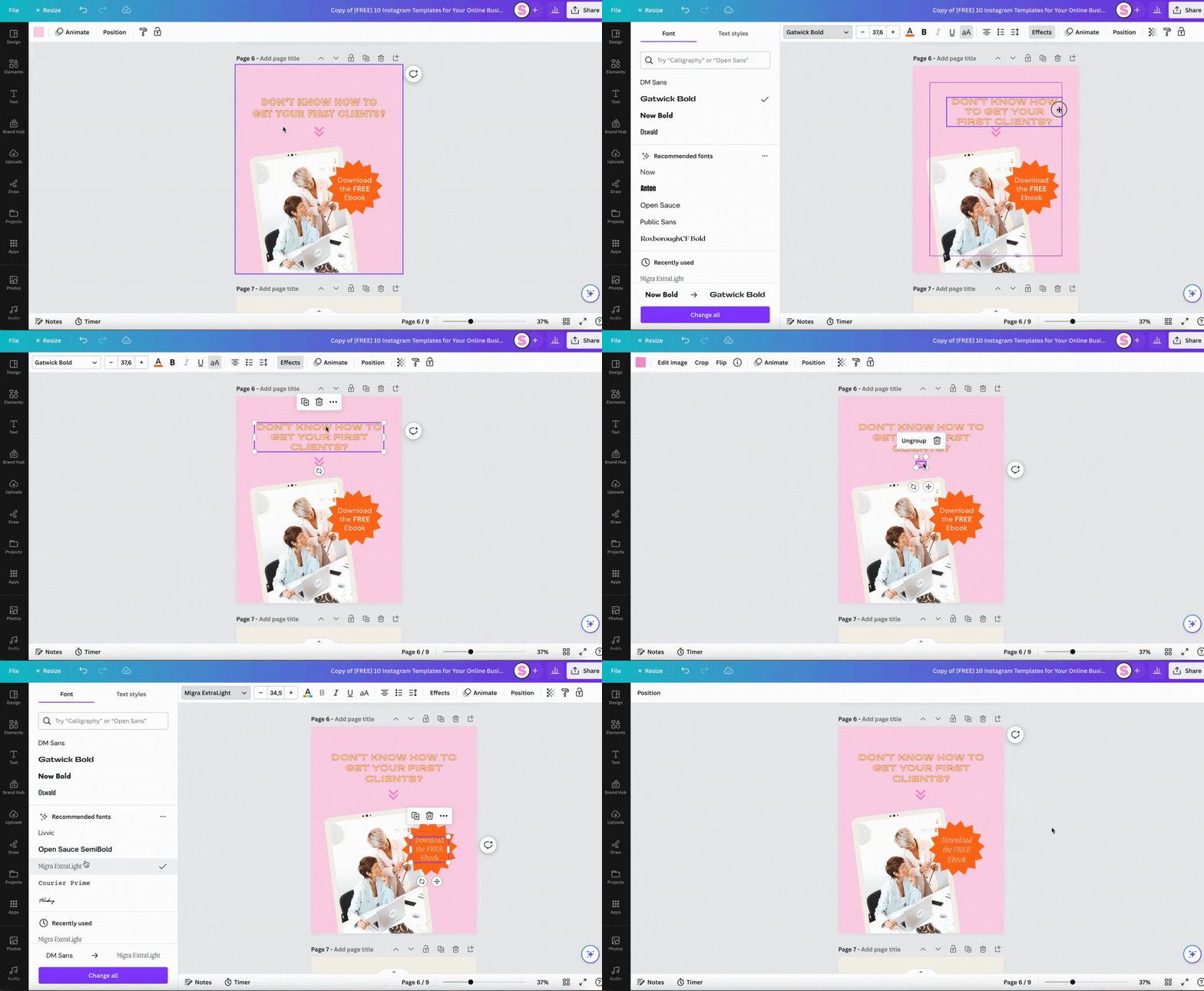
Extra tip: Applying the right spacing to your text and elements can make all the difference between ‘Something here doesn’t look quite right’ and ‘Wow, this looks like made by a designer!’.
Often this happens when you change the font to one that has different specs than in the original template.
A rule of thumb: Use 1.4 as line height for most body copy and headlines – only if you have a headline larger than 40px, you can make the line height smaller.
Note that line spacing also always depends on the font you’re using. Some fonts may need bigger line heights to function properly.
Make sure your brand font also matches with the letter spacing and if it looks better in upper or lowercase.
Designer Tip #4: Add Background Images + Cut-Outs
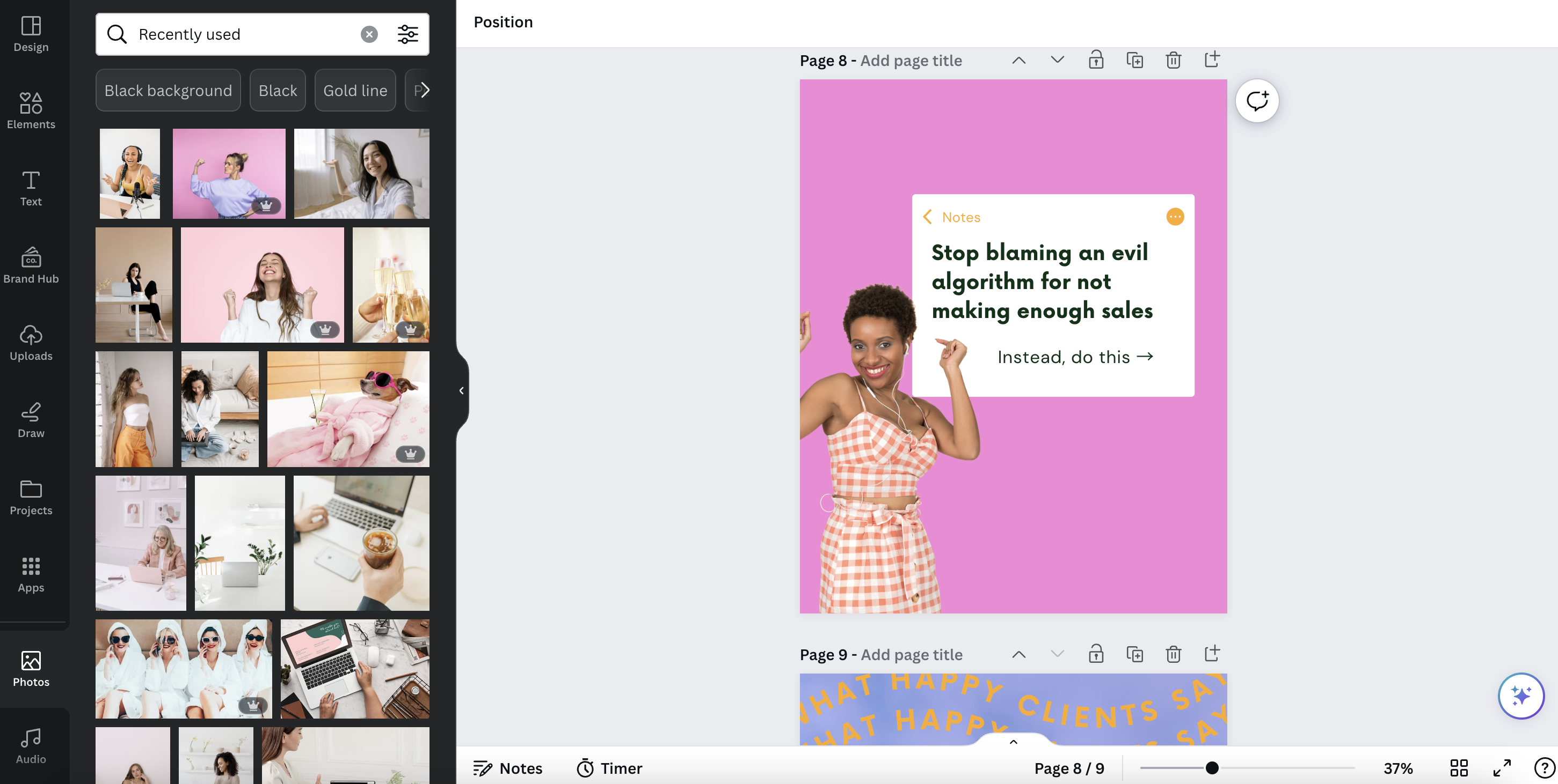
A simple touch that makes all the difference on a template is adding your personal brand photos to it!
This could be through a background image, a photo of yourself or a cut-out photo (you can easily create this with the Background Remover feature in Canva Pro).
You don’t always have to use your own branding photos. Stock photos with a vibe similar to your brand are also perfectly fine.
➡️ Shop our Exclusive Stock Photo Collections
Designer Tip #5: Keep your Designs Clean
One of the mistakes I see many non-designers make when adjusting templates is cram their designs with too much stuff.
But white space is essentital!
Overloaded designs are difficult to understand and people will scroll over, because the first thought they’ll have is ‘Ugh, this looks complicated’.
You want to make it easy for them and leave enough space around your text, between elements and on your graphics in general.
What to do when your design looks overloaded:
- Reduce the amount of text and increase text size
- Remove unnecessary elements that are solely decorative, but don’t serve another purpose
- Increase the inner padding of boxes and leave enough white space between text and borders
- Keep close to the look of the original template and use stickers, logos and extra elements sparingly
